


Why are so many app icons blue? The obvious answer is that so many tech brands contain blue in their logo or elsewhere in their tradedress. But why? What’s with the love of the blue tones people? I ask because the number of blue icons on my phone has reached a kind of tipping point where I’m often firing up the wrong app because I reach for the (wrong) blue one. And then I’m heading to Glide rather than Rdio, or the App Store not Dropbox, or Skype not Shazam.
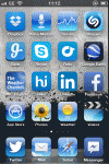
I don’t normally arrange this blue collection on a single page but curious about how much of the stuff is hanging around on my homescreen I created a colour-co-ordinated arrangement (left) which serves to emphasise that it’s both big name apps, such as Facebook and LinkedIn, and newer-comers like Glide and Rdio going for blue. Many of Apple’s native apps (in iOS 6) also rock similar blues, be it Safari, the weather app, stocks, the mail app and so on.
Initially this ‘blue period’ homescreen made finding apps even more confusing but I found that amalgamating all the blue tones actually tends to normalise them, making it easier for their distinct symbols and signs to stand out. So I’m tempted to stick with it. In the mean time, I’m still intrigued as to why tech companies are so hot on blue?
It’s possible there’s some deliberate mimicry going on, on the part of some startups. In seeking to establish their services, they want the user to think about other established tech services they know and love so they feel more confident about using a (similarly blue-coloured) alternative. Thinking of the likes of Skype for messaging and Facebook for social, say. In other words startups are hoping a resonating shade of blue will help them build a strong brand too.
Or they might be hoping to accidentally pass their app off as another the user is used to using; a sort of social engineering of where the user sticks their fingertip to steal taps meant for other apps. That’s risky, since the user didn’t meant to click on your app so may just get annoyed and delete it. Still, a swathe of startups clearly think it can’t harm if they project a similar visual aura to other established apps and services. It’s like the old adage ‘no one ever got fired for buying Microsoft’. Apparently no app icons ever offended by being painted blue.
There are other colour factors to consider too. Various colour preference surveys put blue on top, as the most popular shade for men and women globally. It’s certainly not a Marmite shade that polarises opinion — with so many natural instances of blue (sky, sea, flora) keeping things tranquil. Blue also apparently travels well, being more culturally neutral than certain other colours. Or so the theory goes. Colour theory also says that dark blue shades generate a feeling of reliability and stability (Facebook does have trust issues, after all), while lighter blues are apparently relaxing and calming (Apple’s native iOS 6 apps seem to fall into this category), or uplifting and energising depending on how bright the shade is (the bright blues of Skype and Shazam, say, or Twitter’s bird logo).
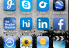
It’s notable that even when some tech brands’ logos don’t actually have that much blue in them, their app icon can often make blue tones far more prominent (like Glide’s icon for instance, right). Meanwhile Twitter, which has its trademark bright blue bird online, switches to a white bird silhouette on a more muted and steady looking blue background for its current iOS app icon. Perhaps the relationship between a mobile device and its user necessitates an extra injection of trust, being as these gadgets are so personal. Therefore developers reach for more muted blue tones when designing their app’s phone icon.
iOS 7′s coat of many coloursApple’s iOS 7 redesign ushers in a new, more neon-colour palette which deliberately ramps up the energy level of the native apps’ colour tones. (You could say they’ve been turned up to Ive.) Apps that were a relatively relaxing shade of blue before now positively pop out — with undertones of teal green/turquoise creeping in. The result is definitely uplifting in the sense that the apps appear to float against the background (a parallax effect Apple is encouraging via other features in its redesign, such as translucent layers and subtle shading effects as you move the phone).
The new look iOS also replaces the blue undercoat on toggle switches with green, and paints some native apps a new shade (like the stocks app now a fittingly bleak shade of black rather than a calming mid-blue), to further highlight how Apple is creeping away from its old mid-blue comfort zone. At a glance, there’s definitely a greater colour range to how Apple is painting the iOS 7 icons, and a lot less blue jackets than there are in iOS 6.
Cupertino has been under pressure to refresh the iOS interface, thanks in part to the accelerated speed with which Google has been driving Android’s look and feel forward. iOS is also now a six-year+ old OS, with more new-look competition crowding in than ever before, whether it’s Windows Phone or BlackBerry 10. One way for Apple to create an impression of change — without having to do radical restructuring which might upset its existing user-base – is a new lick of paint. The iOS 7 palette, including its blues, is certainly far more energetic than the old one — and that’s likely aimed at generating a feeling of renewal, without having to shift too much core furniture and functionality.
The other issue is that perhaps Apple has realised its old favourite blues are becoming a bit stale/invisible because they’ve been so widely adopted. The new iOS 7 palette repaints the goal-posts in more rainbow tones in the short term but, ultimately, app makers will likely fall in step by tweaking their own app shades to harmonise with Apple’s neon brights. So their mid-blues will probably also get dialled up and/or tinged turquoise and green. And before you know it the colour spectrum of apps on the homescreen could be falling in step again.
Whether Apple stepping away from blue will help other developers to kick the coat off their own apps remains to be seen. Apple’s influence will count for something but there’s no reason to think the human eye’s long-term love affair with blue tones is about to be overthrown, no matter how idealistically psychedelic Jony Ive’s redesign.
